Designing Your Site to Look Its Best on Mobile – Insider Hacks from Orlando Website Designer

4 Types of Site Designs and your Mobile Website
These days mobile search has taken over in terms of Google’s new algorithm which is mobile-indexing first. What this means for you is that you should pay close attention to your mobile site.
There are four types of site designs. The design type variations have to do with the code, but they affect how sites display on mobile. The four design types are fixed, fluid, liquid, and responsive.
These days, most themes are designed to be “responsive” themes, meaning that they quickly and easily adapt to any screen size. Many people do not realize that they can access developer tools right from their browser and see what any website will look like on mobile.
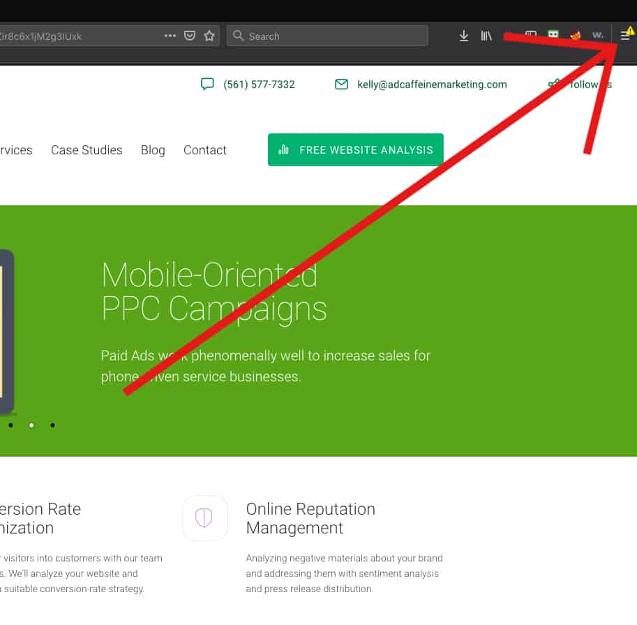
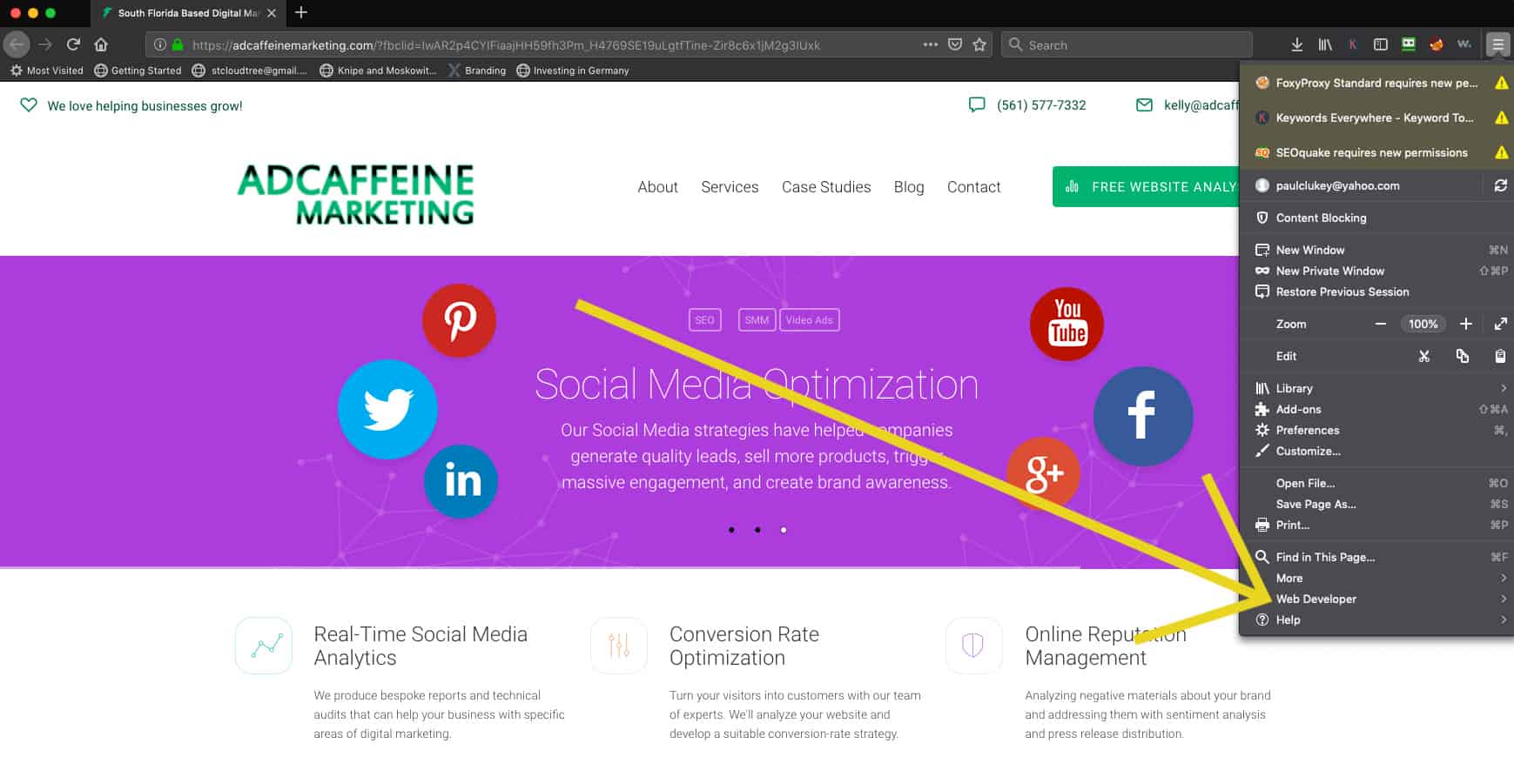
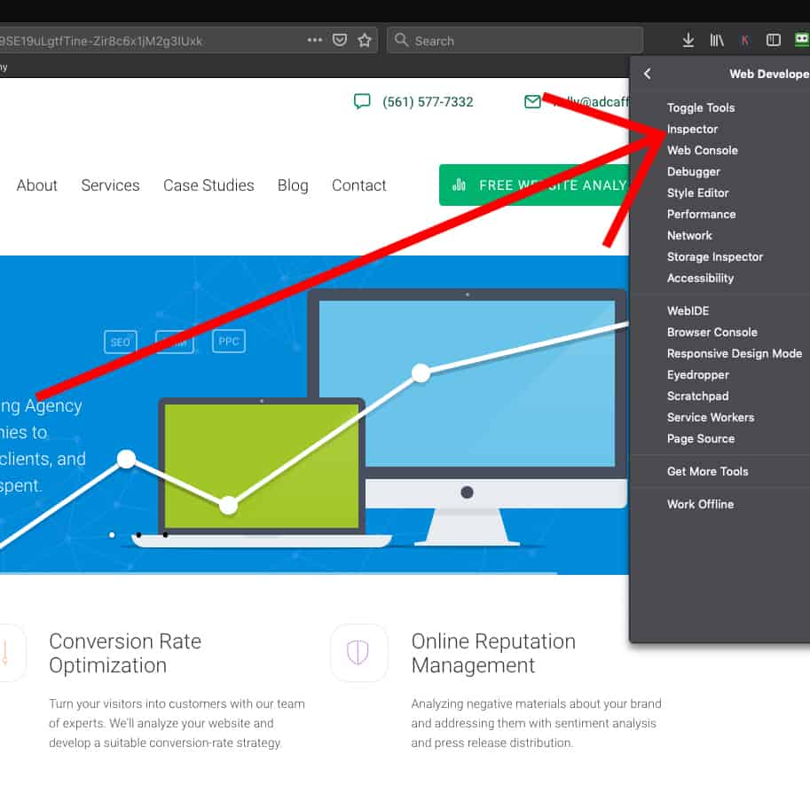
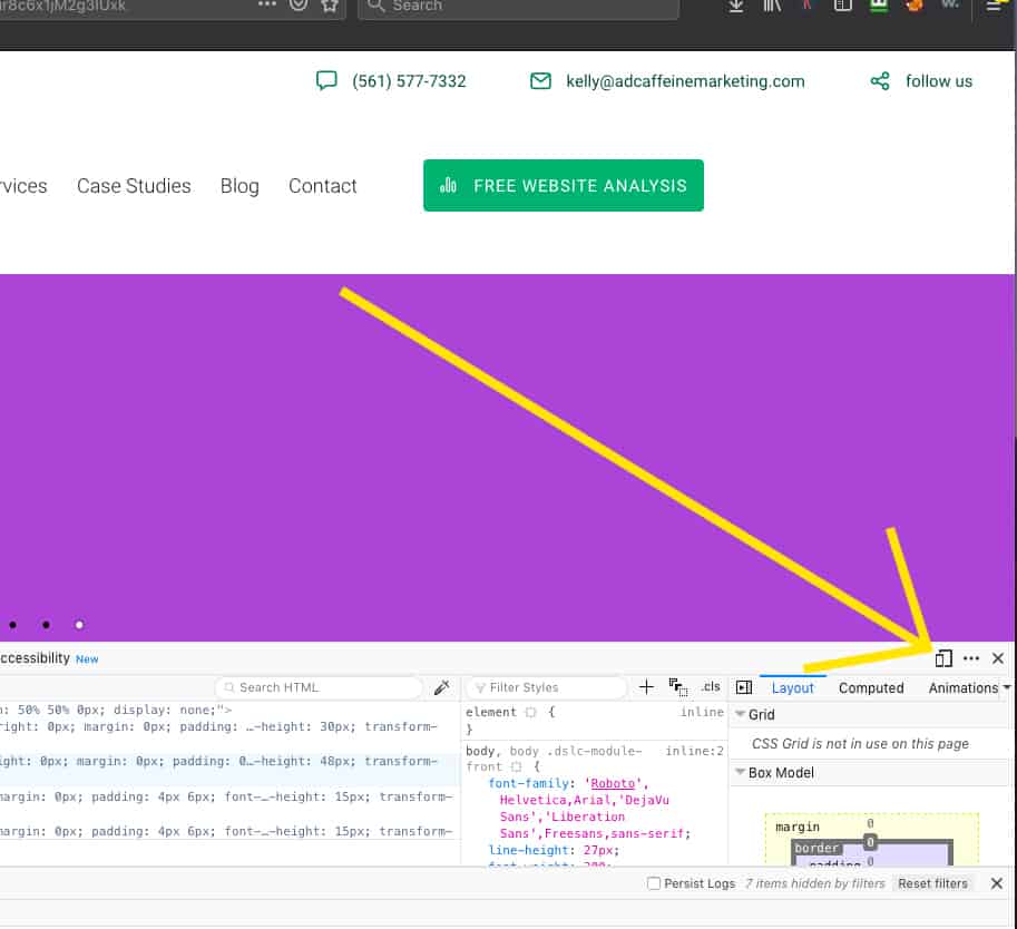
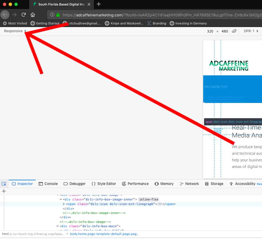
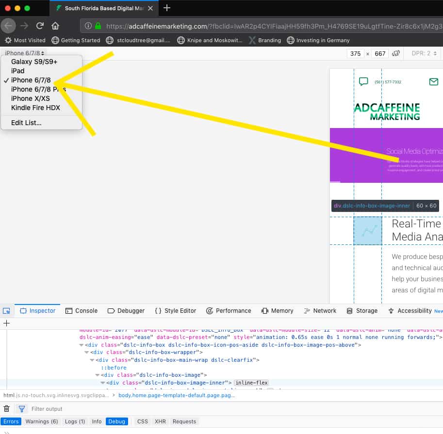
If you’re using Firefox, click on the three lines up at the top right side of the browser window. Open “web developer”, followed by “inspector” then select the device icon and change the responsive type to any screen size by selecting it from the drop-down list of different types of devices. See example below.
In Chrome, navigate to the three top dots or circles and click there. Follow (roughly) the same steps as above.
The area described above is one that I use all the time when I’m developing a new site. I want to make sure that the site is going to look good on all of the different devices.
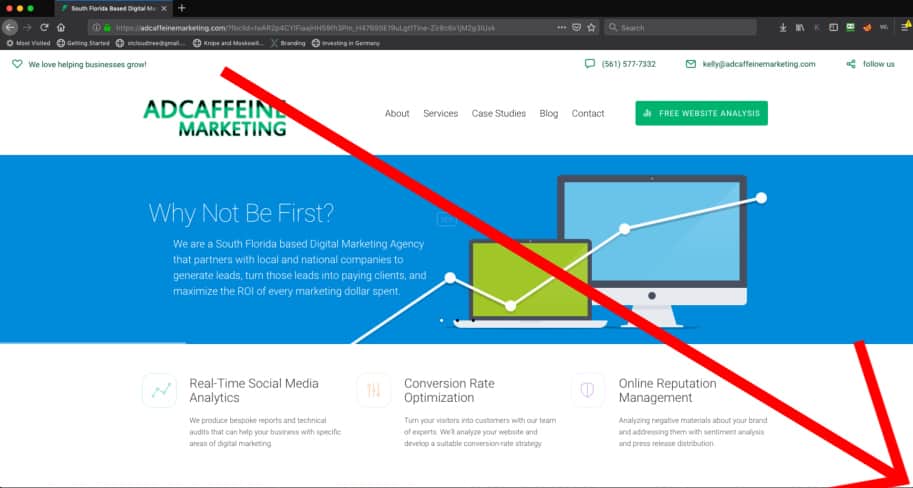
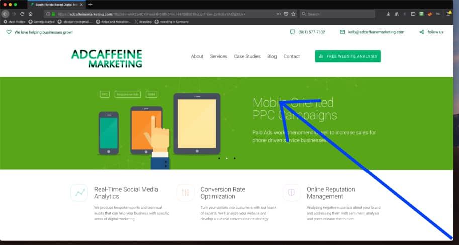
Let’s use our friend’s marketing agency Palm Beach site as an example.
How to Get to the “Mobile Display” version of your site from your Desktop
Step 1. Click on 3 lines (top right of browser)
Step 2. Click on “Web Developer”
Step 3. Click on “Inspector”
Step 4. Click on “Devices” icon
Step 5. Click on “Responsive” to select which type of device to display
Step 6. Select the device you want to display on your desktop
Check the Look on Different Devices
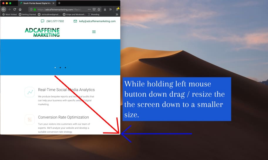
If all that is too complicated for you or if you simply don’t want to go through the steps above, there is a simple hack (see steps below). You can grab a corner of the browser window and shrink it to different sizes and see how your theme/website responds to the different size browser windows.
However, just a note, what I found in doing it this way in particular is that sometimes there are “in between” windows that look awful. Pieces of the menu tend to disappear, words from the menu will slide behind an image, or parts of the text go missing. While you can’t always design a site that matches every nuance of any type of browser window size, you can get pretty close by ensuring that your website looks good across different platforms by using the steps I outlined above.
Many themes have options for choosing whether or not a specific functionality or image will display in a mobile visit. I recommend getting granular for this. Do you want to make sure that your site looks great on mobile and loads fast? Sometimes there is a give-and-take relationship to make this happen. It’s a trade-off. The bottom line is that if your site loads too slowly on mobile, you’ll lose visitors.
Step 1: Position your mouse over the bottom right corner of the browser, the cursor will change to 2 opposite facing arrows indicating that you have “captured” the corner and can change the browser window size.
Step 2: drag the corner up to the left to make the overall screen shrink in size.
Step 3: watch how the responsive screen adapts to the different display sizes and let go where you want it.
Load Speed, Baby! Mobile Speed and AMP
Google is rewarding websites that load quickly. That is part of the reason that they created “Amp,” which stands for Accelerated Mobile Pages. Amp is a stripped-down version of a website. It is designed to have minimal code and to load fast. When Google released its mobile-first index, it changed the playing field for all websites. Now more than ever, geo-targeting, fast mobile load speeds, and a great user interface on mobile platforms play a vital role in who will get ranked in the search results for a specific query.
Sliders & Image Sizes
One thing I especially enjoy about WordPress’s Slider Revolution 5 is that it enables the user who is designing the website to access different areas to create the mobile interface. Their toggle button, located right in the slide editor, allows you to switch between display sizes.
You can even turn off slides for mobile devices. That is set in another area of Slider Revolution. Go to settings and look for “Turn off for Mobile.” When you are developing your slider, you’ll want to make sure that all the boxes look good on mobile devices.
I have discovered that often images and words will end up off-screen. Make sure you resize them, understanding that first you want to create your desktop version and then modify the mobile version. This will ensure that your mobile version changes don’t overwrite your desktop version changes. It can be a bit tricky with learning how to use this particular plug-in.
However, when you get it right, the users will love it, and the site will look great on any device.